Drum roll please. This is the long awaited third and final part of the analysis from JH Dorrington Farm. If you have not already, read the first part and second part.
Leaving where I left off, almost all of our models fit pretty well except for CART, so in what follows, I will ignore the CART model. That leaves us with linear regression models and MARS. MARS essentially builds a piecewise linear model using hinges.
To keep things simple, we will only look at the transformation that removed columns with a large number of missing entries.
models = read_rds("../../data/builds/jh-dorrington/models") %>%
  filter(name != "CART", transform == "Remove NA ")
training = read_csv("../../data/jh-dorrington/train_milk.csv") %>%
  select(-one_of(c("Mean_lac_perc",
                   "Mean_prot_perc",
                   "Mean_fat_perc",
                   "Dam_lact_yield"))) %>%
  drop_na
Some of our models here do feature selection, meaning they will drop some of the predictors automatically. We can see which one are dropped by varying a predictor and seeing if the model prediction changes.
dropped_cols = function(model){
  names = names(training[-1])
  n = length(names)
  base = matrix(0L, nrow = n, ncol = n) %>%
    as.tibble
  names(base) = names
  base = predict(model, base)

  inc = diag(n) %>%
    as.tibble
  names(inc) = names
  inc = predict(model, inc)

  tibble(column = names) %>%
    mutate(dropped = inc == base)
}
models %>%
  select(name, fit) %>%
  mutate(dropped = map(fit, dropped_cols)) %>%
  unnest(dropped) %>%
  mutate(dropped = ifelse(dropped,
                          "Drop",
                          "Keep")) %>%
  ggplot(aes(column, name, fill = dropped)) +
  geom_tile(colour = .colr[1]) +
  scale_fill_hue(l = 43) +
  guides(fill = guide_legend(title = NULL)) +
  labs(title = "Predictor selection by model",
       x = "",
       y = "") +
  theme_minimal() +
  theme(axis.text.x = element_text(angle = 45, hjust = 1))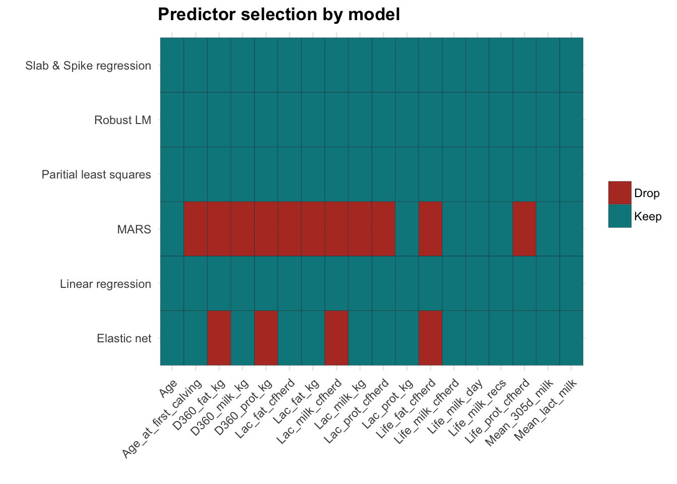
Interestingly, MARS seems to drop quite a few columns. Elastic net and MARS agree on what to drop, it’s just that Elastic net is not as aggressive in dropping predictors.
Since we are left with additive models, we can explore these with marginal plots. One at a time for each predictor, we vary one predictor and keep the rest fixed. Then we use this to obtain a prediction under the model, which we can plot in 2 dimensions. Importantly for additive models, the value of the fixed variables only changes the height of the plot. In our plots, we can just fix this by insisting that the y axis starts from zero.
margin_plot = function(name, model, chop = 20){
  names = names(training[-1])

  map_df(names,
         function(col){
           df = matrix(0L, nrow = chop, ncol = length(names)) %>%
             as.tibble
           names(df) = names
           lo = min(training[col])
           hi = max(training[col])
           df[col] = seq(lo, hi, length.out = chop)
           df %>%
             mutate(pred = predict(model, df),
                    pred = pred - first(pred),
                    model = name,
                    column = col) %>%
             rename_("col" = col) %>%
             select(model, column, col, pred)
         })
}
margin_df = map2_df(models$name, models$fit, margin_plot)
margin_df  %>%
  ggplot(aes(col, pred, colour = model)) +
  geom_line() +
  facet_wrap(~column, scale = "free") +
  labs(title = "Marginal plots",
       x = "Predictor",
       y = "Change in prediction") +
  guides(colour = guide_legend(title = NULL)) +
  theme(legend.position = "bottom")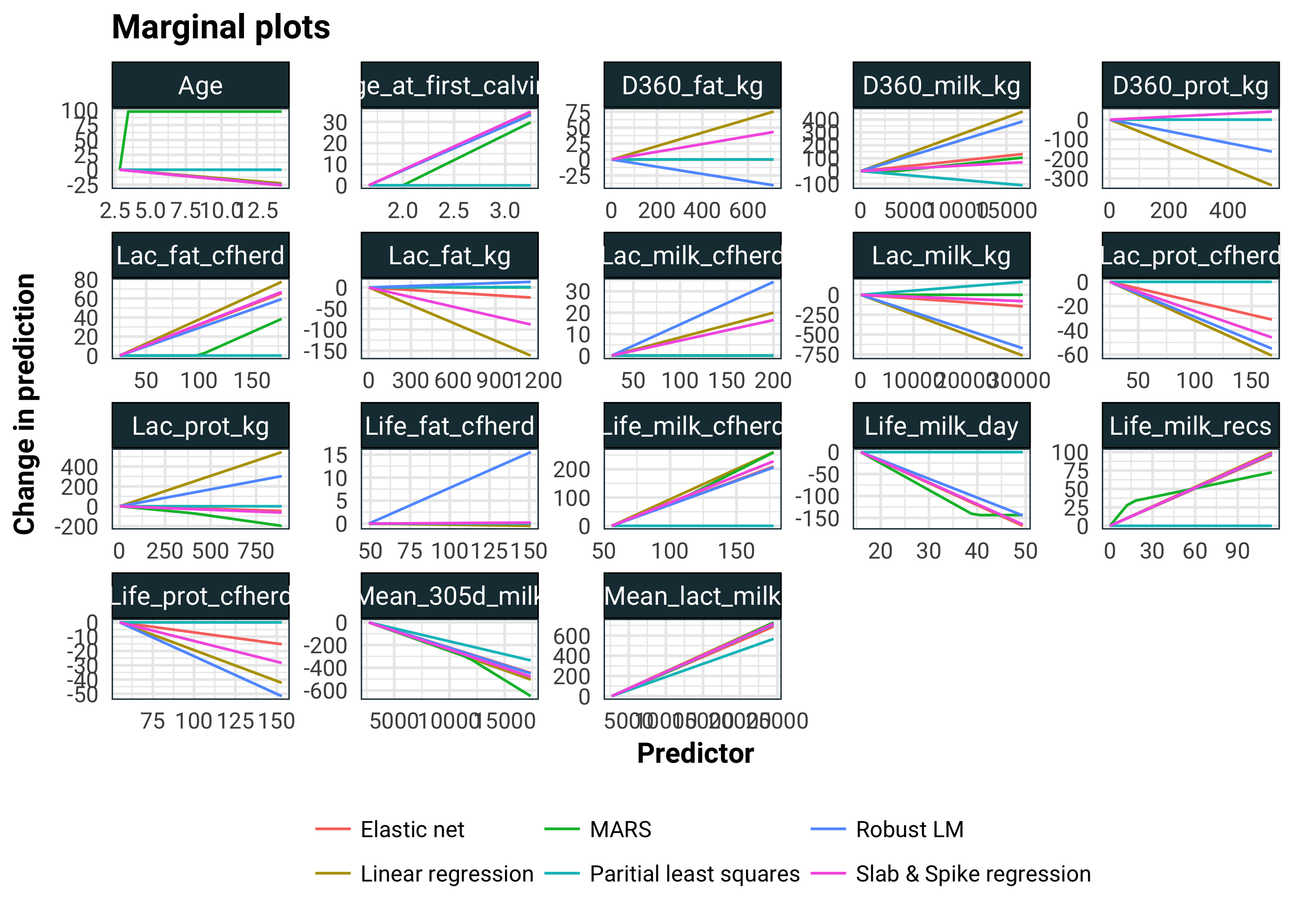
Looking at the age predictor, I am inclined to think that the pure linear models (i.e. all of them other than MARS) are compensating for the non-linearity of the Age predictor. We see agreements with Mean_305d_milk and Mean_lact_milk. Not only do all the models agree, but they all have quite significant slopes here. In the linear model, D360_prot_kg and Lac_milk_kg have suddenly come to life. Rather worryingly, Lac_prot_kg has changed sign from the MARS model. We should be a little sceptical of the linear model. There are highly correlated predictors and compensation for non-linearity going on here.
To get a numerical assessment of the importance of a predictor, we could use caret::varImp computed using some wizardry. Unfortunately, this is not quite consistent across models and it also is based on the training set.
Instead, to judge the importance of a predictor, we will take the holdout sample and make the predictor in question constant by replacing it’s values by it’s mean. Then we will compare MSE of the model on the holdout set and the modified holdout set and compute an F-statistic.
test = models$test[[1]]
mean_stat <- function(name, model){
  map_df(names(test[-1]),
      function(col){
        rss1 <- test %>%
          mutate_at(vars(one_of(col)), funs(mean)) %>%
          predict(model, newdata = .)  %>%
          `-`(test[1]) %>%
          `^`(2) %>%
          sum
        rss2 <- sum((predict(model, test) - test[1])^2)
        tibble(model = name,
               column = col,
               stat = (rss1 - rss2) * (nrow(test) - ncol(test) + 1) / rss2)
      })
}
mean_stat_df = map2_df(models$name, models$fit, mean_stat)
mean_stat_df %>%
  ggplot(aes(reorder(model, stat), stat, fill = model)) +
  geom_bar(stat = "identity", position = "dodge") +
  coord_flip() +
  facet_wrap(~ column) +
  guides(fill = F) +
  labs(title = "F-statistics on the holdout set",
       x = "",
       y = "F-statistic")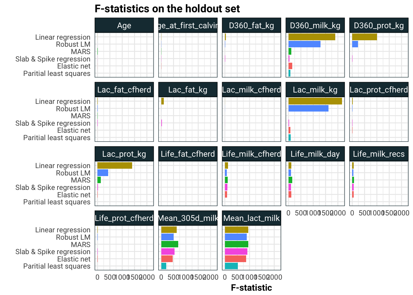
I think what is going on here is that the linear models are spreading the effects of Mean_305d_milk and Mean_lact_milk to other correlated predictors like Lac_prot_kg, Lac_milk_kg, D360_prot_kg and D360_prot_kg.
Finally let’s look at the components of partial least squares.
pls = models %>%
  filter(method == "pls") %>%
  .$fit %>%
  .[[1]] %>%
  .$finalModel
pls$coefficients  %>%
  as.tibble %>%
  rownames_to_column %>%
  rename(`Comp 1` = `.outcome.1 comps`,
         `Comp 2` = `.outcome.2 comps`,
         `Comp 3` = `.outcome.3 comps`) %>%
  gather(comp, value, -rowname) %>%
  ggplot(aes(reorder(rowname, abs(value)), value, fill = rowname)) +
  geom_bar(stat = "identity") +
  facet_wrap(~comp, scale = "free_x") +
  coord_flip() +
  guides(fill = F) +
  labs(title = "Components of partial least squares",
       x = "",
       y = "Coefficient")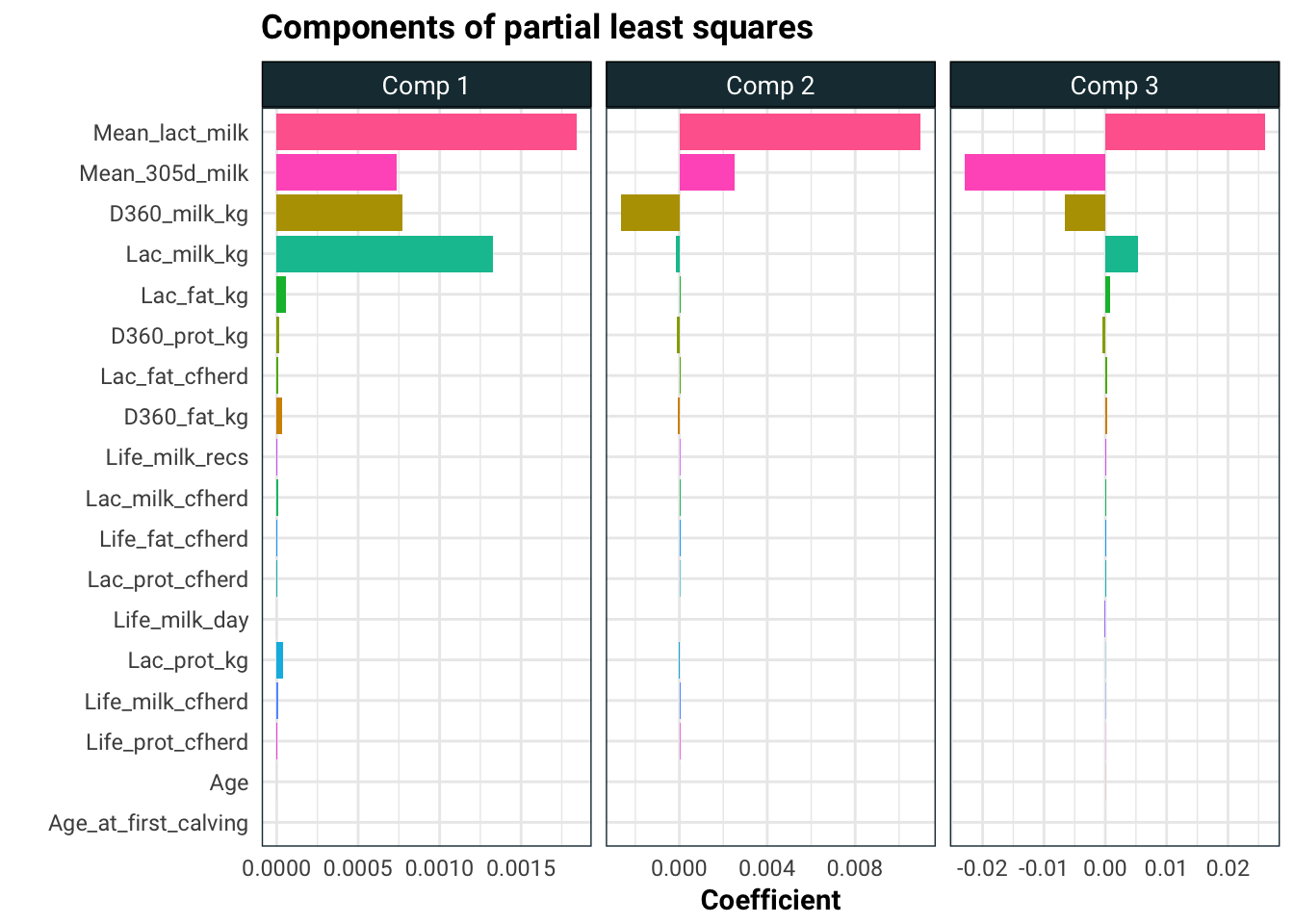
The story here is pretty consistent. The only significant effects on average calving interval appear to be the amount of milk the cow produces and the amount of lactose in that milk. The predictors Life_cfheard and Life_milk_day also look like promising candidates but since the effect is subtle, we would need more data to analyse these.
Well that settles that. I hope you enjoyed this three part analysis!