If you have a data set with large number of predictors, you might use some basic models to try and eliminate some of the predictors that don’t show a significant relationship to the response variable. In such cases it is important to look at the correlation between the predictors. How important? Let’s find out.
Let us consider a very simple example here with two predictors and one response variable.
set.seed(2017)
data = tibble(x1 = rnorm(1000)) %>%
  mutate(y = 2 * x1^3 + rnorm(1000),
         x2 = 1.2 * x1 + rnorm(1000, 0, 0.01))
You might be wondering why I would fit a linear model to what obviously is not a linear relationship. In real life when you have a large number of predictors, it is difficult to say if the relationship is linear or not. That’s because all models are just an approximation. Linear models can be very useful to identify if there is a relationship in a very crass way, even when the variance of the data set is really high. The example above is my hand crafted small version of reality.
Using linear separately on each predictor looks pretty good.
data %>%
  gather(pred, value, x1, x2) %>%
  mutate(pred = ifelse(pred == "x1",
                       "First predictor",
                       "Second predictor")) %>%
  ggplot(aes(value,y, colour = pred)) +
  geom_point() +
  geom_smooth(se = F, method = "lm", colour = .colr[1]) +
  labs(
    title = "Relationship of the individual predictors against the response",
    x = "Predictor",
    y = "Response"
  ) +
  facet_wrap(~pred) +
  scale_colour_hue(l = 25) +
  guides(colour = F)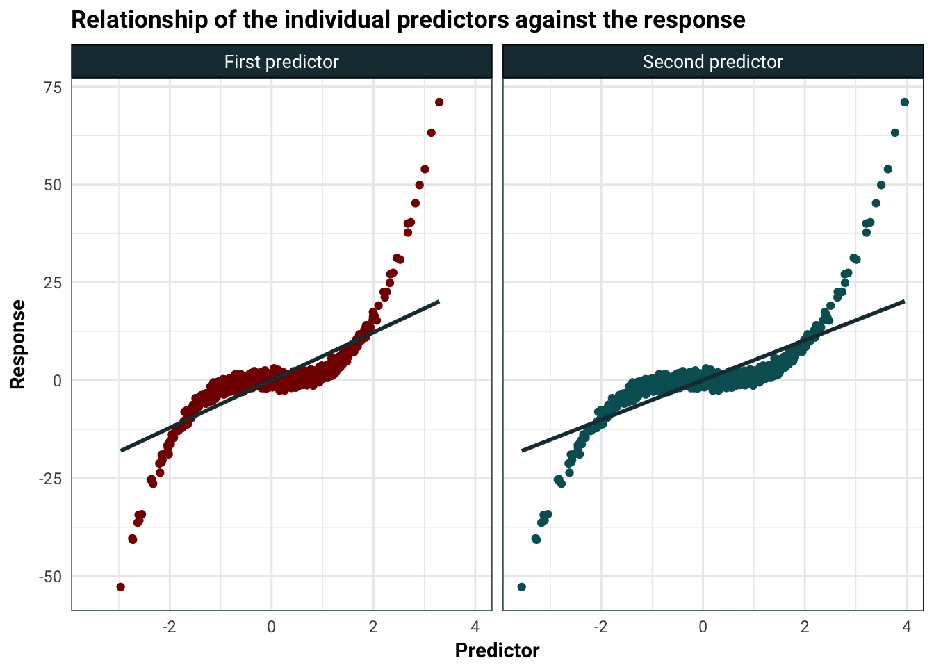
Let’s talk numbers.
lm1 = lm(y ~ x1, data = data)
lm2 = lm(y ~ x2, data = data)
tidy(lm1) %>%
table_print()| term | estimate | std.error | statistic | p.value |
|---|---|---|---|---|
| (Intercept) | 0.0754883 | 0.1563954 | 0.4826757 | 0.6294319 |
| x1 | 6.0977275 | 0.1591227 | 38.3209115 | 0.0000000 |
tidy(lm2) %>%
table_print()| term | estimate | std.error | statistic | p.value |
|---|---|---|---|---|
| (Intercept) | 0.0786647 | 0.1563769 | 0.5030456 | 0.6150432 |
| x2 | 5.0810234 | 0.1325683 | 38.3275912 | 0.0000000 |
As we can see, the model with one of the predictors gives significance. I wouldn’t rely pay too much attention to the p-value as the residuals certainly will not be normal, but the t-statistics are huge. This is a good sign since both predictors are significantly related to the response.
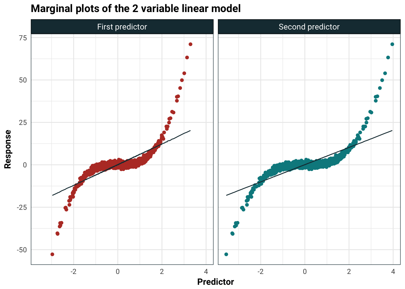
So when if we use a model with both predictors, we should also get something significant, right? Well, not quite…
lm3 = lm(y ~ ., data = data)
tidy(lm3) %>%
table_print()| term | estimate | std.error | statistic | p.value |
|---|---|---|---|---|
| (Intercept) | 0.0802194 | 0.1567639 | 0.5117209 | 0.6089596 |
| x1 | -2.9685109 | 18.8311511 | -0.1576383 | 0.8747737 |
| x2 | 7.5543171 | 15.6902344 | 0.4814662 | 0.6302909 |
Catastrophically, the t-statistic fell by quite a bit and the sign on the second predictor is negative even though the marginal predictions pretty much seem the same:
data %>%
  mutate(Predicted = predict(lm3, newdata = data),
         Actual = y) %>%
  gather(pred, value, x1, x2) %>%
  mutate(pred = ifelse(pred == "x1",
                       "First predictor",
                       "Second predictor")) %>%
  ggplot(aes(value, colour = pred)) +
  scale_colour_hue(l = 44) +
  geom_point(aes(y = Actual)) +
  geom_line(aes(y = Predicted), colour = .colr[1]) +
  facet_wrap(~ pred) +
  guides(colour = F) +
  labs(
    title = "Marginal plots of the 2 variable linear model",
    x = "Predictor",
    y = "Response"
) 
You might be thinking that this is just a problem for linear models, but this is not the case. For example, we can see that random forest performs really well here, even though it also incorrectly asserts the importance of the predictors:
library(caret)
trControl = trainControl(method = "none")
rf = train(y ~ ., data = data,
           method = "rf",
           trControl = trControl,
           importance = T)
new_data = tibble(x1 = seq(-2,2,0.1), x2 = 1.2 * x1)
new_data %>%
  mutate(Predicted = predict(rf, new_data)) %>%
  mutate(Actual = 2 * x1^3) %>%
  gather(type, value, Predicted, Actual) %>%
  ggplot(aes(x1, value, colour = type)) +
  geom_point() +
  geom_line() +
  labs(
    title = "Random forest",
    x = "First predictor",
    y = "Response"
  ) +
  guides(colour = guide_legend(title = NULL))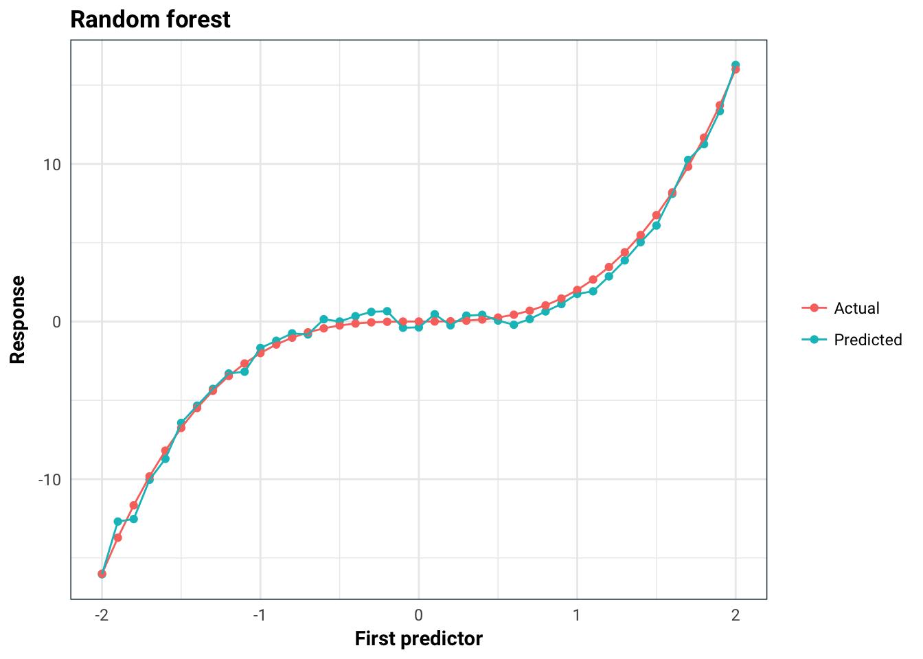
varImp(rf, scale = F) %>% plot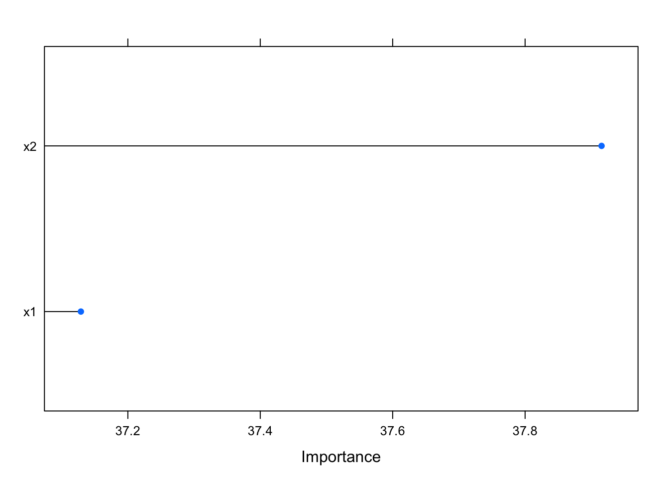
And that’s why you always you always check for correlation.